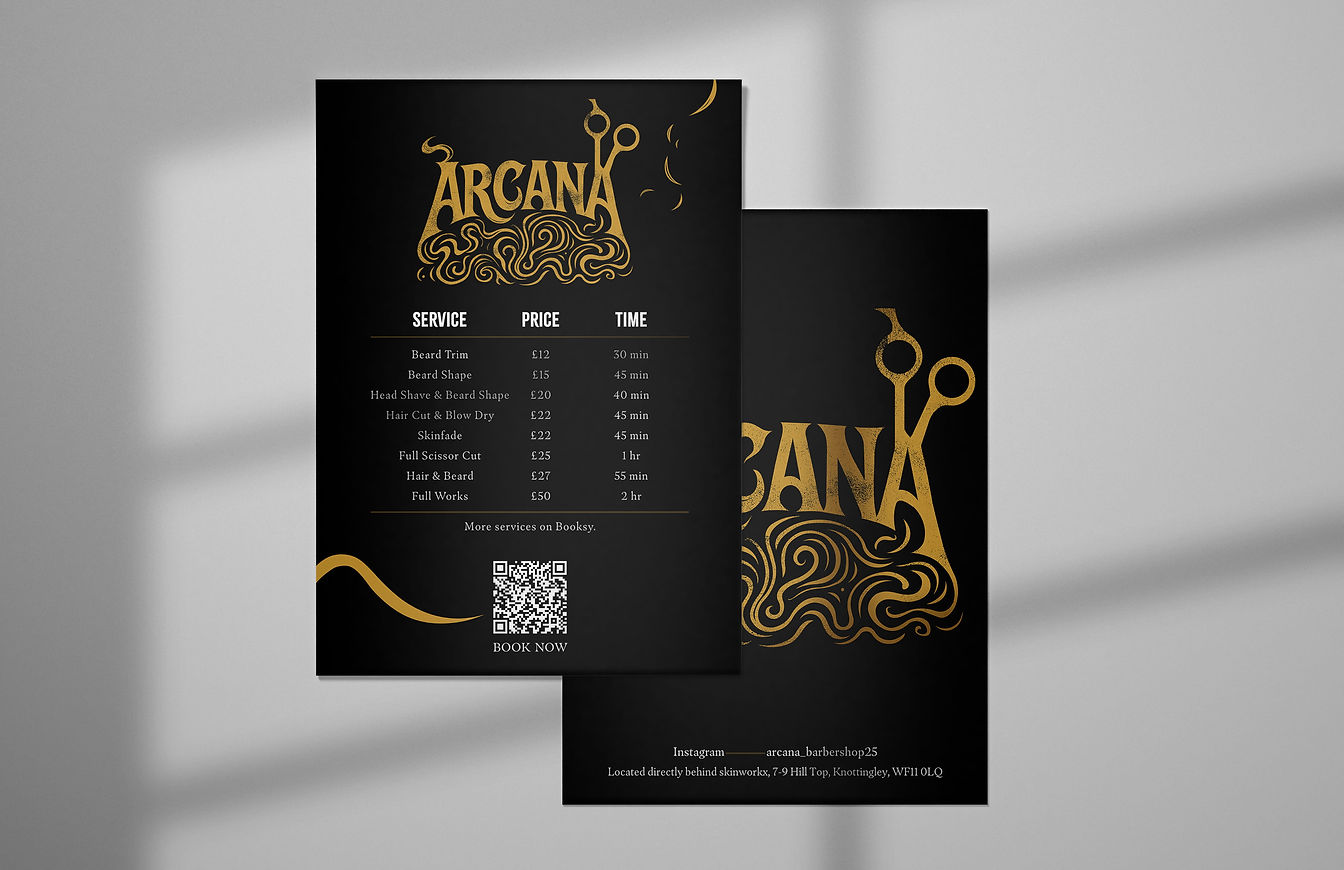
ARCANA
Arcana means secrets and mysteries, and my client wanted a barbershop logo that captured this concept while feeling modern, minimal, and edgy.
The challenge was adapting to the client’s preferred style of communication while creating a brand that felt distinct from the previous owner.
Process: Worked closely with the client to understand their needs, produced initial sketches, gathered feedback, and refined the designs through rounds of amendments to deliver the final design in all formats.

My idea: A clean, modern sans-serif typeface to set the brand apart from competitors, paired with a versatile combination mark inspired by the Hermit tarot card and designed for use across all applications.

Result: The client selected my third concept, leading to further commissions for branded materials after refining the logo in close collaboration.
3rd concept.

My 3rd concept.